Check the details
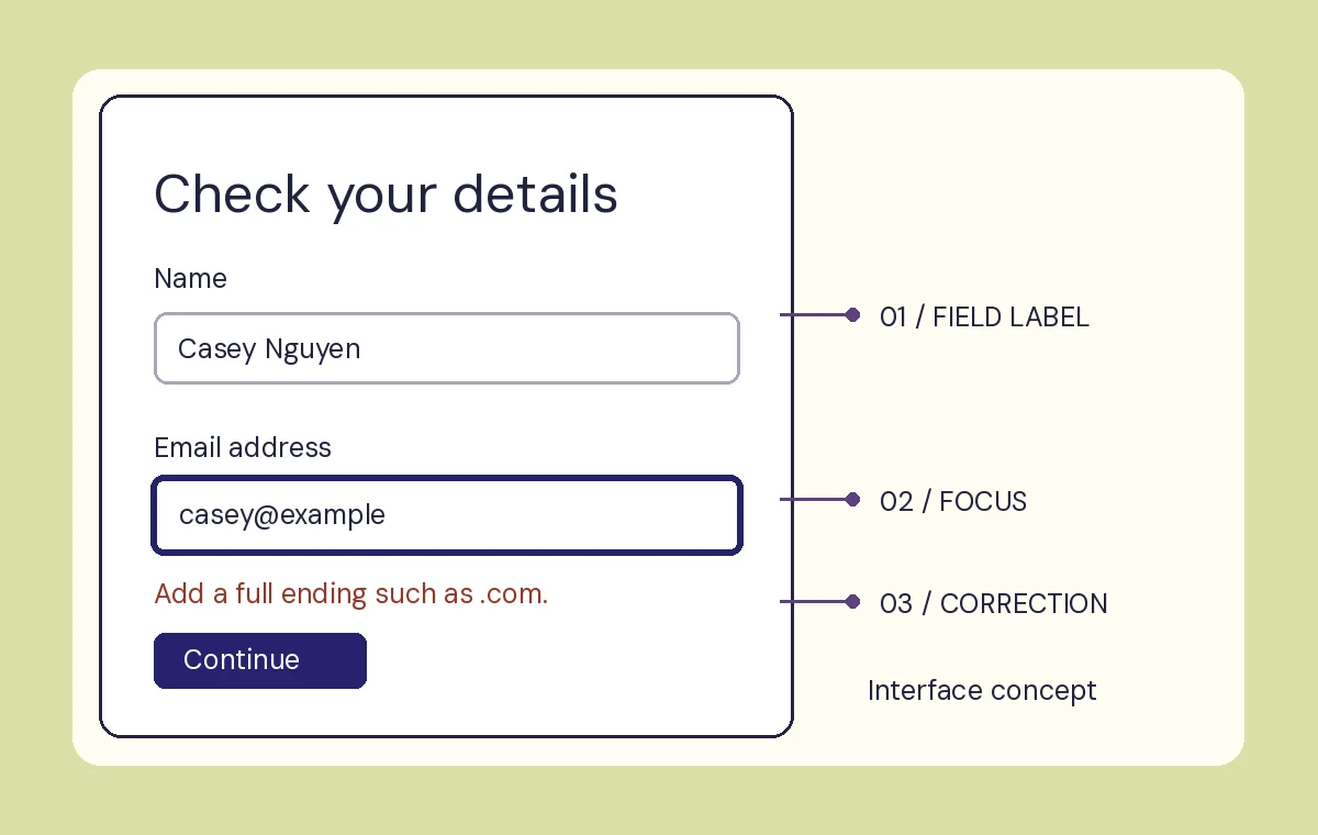
A close look at a fictional sign-up step after a mistyped email address.
The question
Can the screen explain the correction and leave everything else exactly where the reader expects?
The design decision
The field label stays above its example value. The correction names the missing part of the address and appears beside the field. A dark outline, a distinct label and clear wording help identify the active field and the error even when the screen is viewed without color.
Where the example ends
The example is an original static illustration. It contains fictional data and has no account, authentication or messaging functions. A production interface needs implementation and assistive-technology testing in its actual environment.
Prepare study feedback